Welcome to the seventh installment of the Learn to Build Better series. This multi-part series showcases the tools and techniques to rapidly build, test, and prototype energy-focused applications, analytics and use cases on the Awesense Platform, using the Energy Data Engine™ to process data, and TGI or APIs to access and visualize the data structured according to the Awesense open Energy Data Model (EDM).This episode focuses on Geographical Information System tools (GIS Tools) and their importance energy data analytics.
What are GIS Tools, and why do we use them?
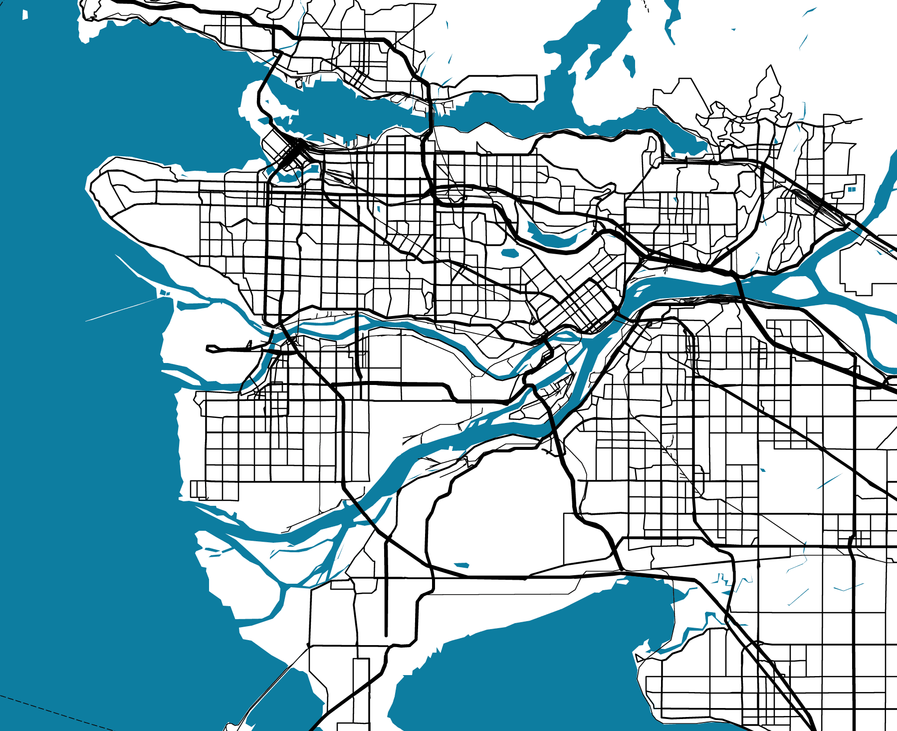
A Geographical Information System (GIS) is a computer-based tool used for analyzing and visualizing geographic information. It is a system designed to capture, manipulate, analyze, manage, and present all spatial or geographical data types.
GIS technology allows users to view, understand, interpret and visualize spatial data in various ways. It provides a means to create maps and integrate and analyze data from various sources, including satellite images, aerial photographs, GPS data, and other location-based data sources.
GIS applications are used in various fields, including environmental management, urban planning, land use management, transportation planning, natural resources management, emergency management, and of course, power transmission and distribution. Some of the key benefits of GIS technology include improved decision-making, enhanced understanding of spatial relationships, improved communication and collaboration, and better resource allocation.
Many examples of GIS (Geographic Information System) software area are available on the market today, ranging from open-source options to enterprise-level solutions. Here are some examples:
- Quantum GIS (QGIS) – QGIS is an open-source GIS software that allows users to create, edit, and analyze geospatial data. It is available on multiple platforms and has many features, including support for many different data formats and powerful data processing tools.
- ArcGIS by Esri – ArcGIS is a popular GIS software used by many organizations worldwide. It offers a range of tools for creating, managing, and analyzing geographic data, including 2D and 3D mapping, spatial analysis, and data visualization.
- Google Earth Pro – Google Earth Pro is a free desktop application that allows users to explore the world through satellite imagery, 3D terrain, and other data layers. It also includes tools for measuring distances and areas, creating tours, and importing and exporting data.
- GRASS GIS – GRASS GIS is another open-source GIS tool that provides geospatial data management, analysis, and visualization tools. It also includes many geostatistical tools and supports numerous data formats.
Quantum GIS (QGIS)
Many of the tools in this blog series were open-source; it will not be different this time. We will choose QGIS as an example. QGIS is a prominent player in the GIS field for several reasons:
- Free and open-source – QGIS is free to download and use, and its open-source nature means that it can be customized and modified to suit individual needs.
- User-friendly interface – QGIS has a user-friendly interface that is easy to navigate, even for beginners. It also offers a wide range of tutorials and documentation to help users get started.
- Wide range of features – QGIS offers a wide range of features for creating, editing, and analyzing geospatial data, including support for numerous data formats, powerful data processing tools, and 2D and 3D mapping capabilities.
- PyQGIS – Python API for QGIS, a set of Python modules that allows developers to build custom GIS applications and plugins that can interact with QGIS.
- Active community – QGIS has a large and active community of users and developers, which means that plenty of resources are available for troubleshooting and getting help with any issues that may arise.
QGIS with Awesense EDM data: an example
The example through which we will demonstrate how Awesense EDM and QGIS create a great combo will be focused on publishing maps of the distribution area. More specifically, the example will produce a hosting capacity map of the distribution area feeders so any utility customer can browse the map and obtain information about the available hosting capacity at each part of the feeder. This example will be demonstrated on the Awesense Sandbox environment and its synthetic dataset. Please contact us if you want access to this development environment.
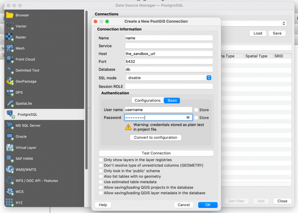
The first step is to connect the QGIS to Awesense EDM using the SQL API. This procedure is the same as the ones demonstrated in previous parts of this series. Users would use the same credentials as those used for Awesense’s True Grid Intelligence (TGI) frontend application. In QGIS, go to Layer -> Add Data Source -> PostgreSQL and click on New.
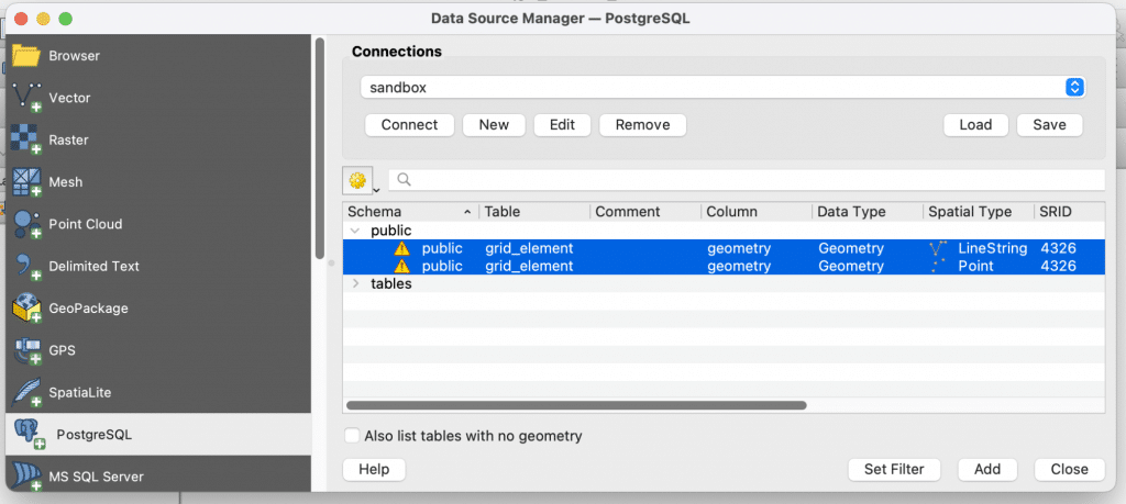
After a successful connection to Awesense EDM, the grid elements’ geometry data is available. To load the data as layers into QGIS, just highlight the data and click on “Add”.
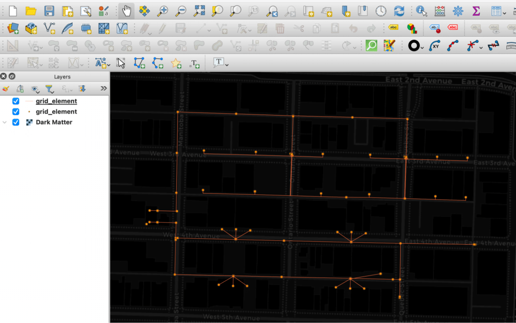
Once data is loaded, optionally, the map tiles can be added, and there you go – the distribution area GIS data is loaded into QGIS for further processing.
Since QGIS is quite versatile, there might be other options for loading the Awesense EDM data into QGIS. Additional options might be:
- Using DB Manager (core QGIS plugin). This allows you to run custom SQL queries and then load the resulting table as a QGIS layer. We will use DB Manager for running custom queries later.
- Using Processing Toolbox tools like, for example, “PostgreSQL execute and load SQL”.
- Using QGIS’s python console with modules like psycopg or others.
Let’s continue with our real-world example, the publishing of the hosting capacity map of the distribution area feeders. To simplify this scenario, we will make a (significant) shortcut and assume the hosting capacity is a function of the conductor path length from the connected/parent substation. So the longer the connected conductor length between the substation and connection point is, the lower the capacity. For sure, the real hosting capacity calculation is much more complex and would have to incorporate load time series data (also available via Awesense EDM), but this is not the scope of this article.
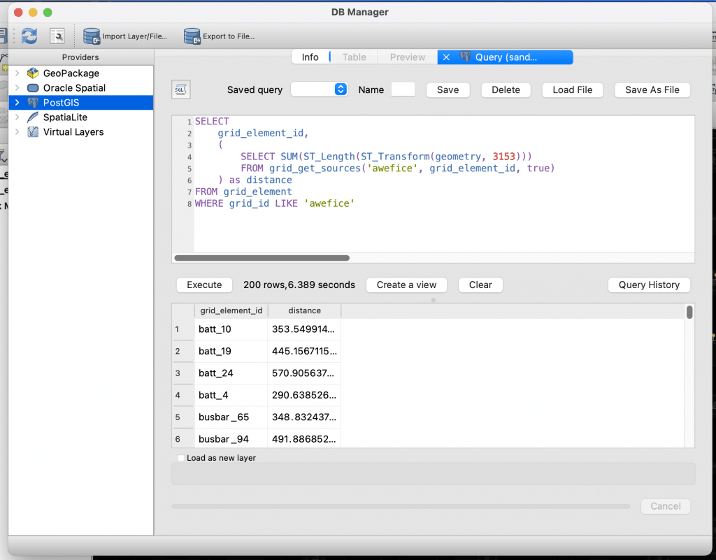
So let’s go ahead and build the map. We will use a custom query (see the image below) to obtain the conductor connection path length. For this, go to DB Manager, click on the connected database and open the SQL Window. Here we will enter the query for producing the required data. After the query produces the table, use the “Load as new layer” option to add the table to QGIS.
The next step is to join the data with the loaded dataset. This can be accomplished by right-clicking the target layer Properties -> Joins -> Add new join and filling up the UI.
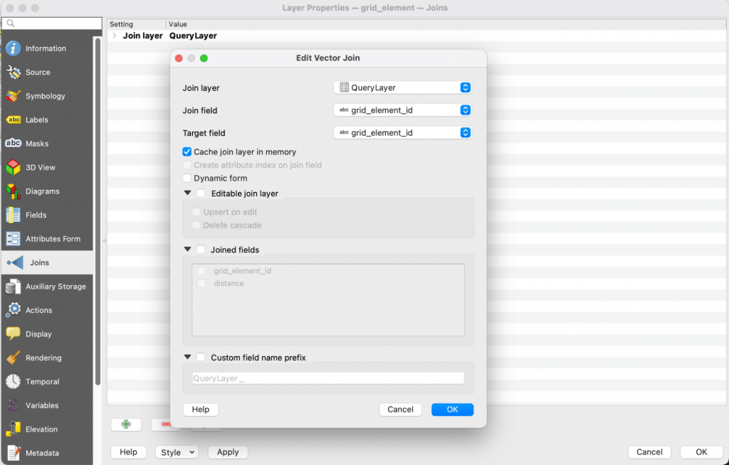
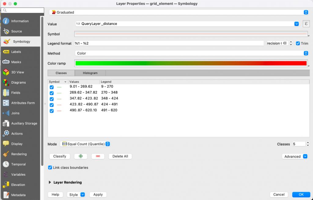
Now we have the connected path lengths joined with the master layer, the next step is to visualize the pretended hosting capacity. This can be achieved by the Symbology of the layer. For that, right-click the target layer Properties -> Symbology -> Choose “Graduated” -> Value will be the distance and pick the desired colours. As a last step, click “Classify”.
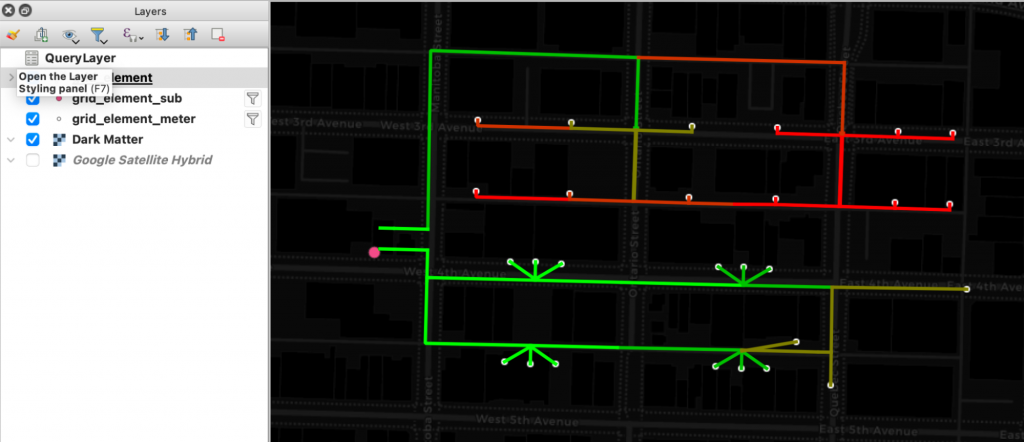
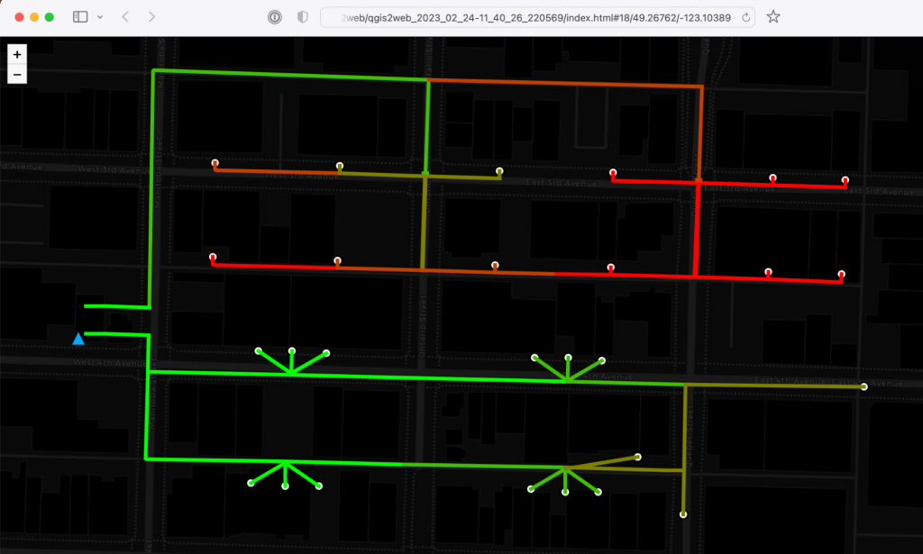
The resulting QGIS map looks like this. It is visible that our simplified hosting capacity is decreasing by increasing the path length from the substation. To better understand, we stylized the consumption points (EDM meters element type) as a white circle and the substation (EDM enclosure element type) as a blue triangle.
The last step is to publish this map. Usually, electricity distribution companies publish such maps on their websites. If the website is the target, exporting it into HTML is a viable option. For this, we will use the QGIS plugin called qgis2web, which aims at easy publication of QGIS maps into the web (HTML). After the plugin is installed and opened, it offers a myriad of customization options – we will not go into that now.
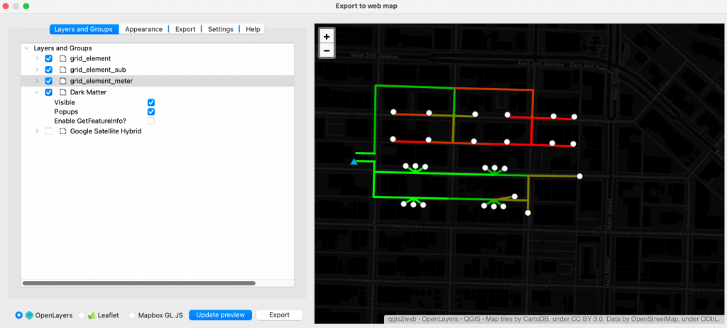
This plugin will export the desired map into HTML, which can be attached to any website or opened as a standalone application in the browser.
Summary
In this Build Better blog series post, we explained GIS tools and what they are. We demonstrated how to connect the Quantum GIS (QGIS) to Awesense EDM. How to stylize layers and produce your own map for the real-world example of publishing a hosting capacity map of the distribution area feeders.
Free For a Chat?
We love to connect with our wide audience and would love for you to share our content! Follow along with this series and let us know what ideas you would like to see us write about. Whether it’s more content about the topics we’ve already written on or even a specific use case or tool you would like to know more about, let us know.
If you or your team are interested in building a custom application or use case using the Awesense Platform, or you have an analytical tool you would like us to demonstrate with our platform, please feel free to reach out at tools@awesense.com.
