Welcome to the fourth installment of the Learn to Build Better series. This multi-part series showcases the tools and techniques to rapidly build, test, and prototype energy-focused applications, analytics and use cases on the Awesense Energy Transition Platform, using the AI Data Engine to process data, and TGI or APIs to access and visualize the data structured according to the Awesense open Energy Data Model (EDM).
So what are Business Intelligence Tools (BI Tools)?
BI Tools are tools that amass and congregate large amounts of organizational data, visualizes it, and makes it easier to read. Working with data this way can make any team’s decision making process simpler and more impactful.

What’s so great about these BI Tools?
We love working with BI Tools because they’re so simple! Often containing the best elements of Low and No Code development, they align with a core Awesense value, democratization of information. That said, some knowledge of SQL will smoothen your transition into a BI Tool expert.
Aside from the fact that they’re making data more accessible to a wider audience, BI Tools are primarily used to visualize data and build dashboards and reports. This means that data can now be understood more easily, and people can use that information to make clear decisions for their organization.
Who uses BI Tools?
Knowledge of any major BI tools is a must-know skill for any Data Analyst – we can confidently say that BI tools play an important step in their professional development curve. That’s why we recommend taking the time to familiarize yourself with a BI Tool.
Here at Awesense, we believe in the power of data. Despite TGI’s capable, flexible charting features, we recommend using BI Tools. No matter the situation, BI Tools often have a unique component to offer and can enhance your understanding of data in different ways. With lots of visualization options and widgets, BI Tools are an essential part of building energy-focused analytics!
Common BI Tool Applications
Some common big names in the BI Tool space include Power BI, Tableau, AWS Quicksight, Qlik and Google Looker. Awesense’s TGI tool integrates easily with all of these, but today we’ll dive deeper into Microsoft’s market leader, Power BI.
Power BI and How It Changed the Game
Microsoft has put their money where their mouth is. As of 2016, Power BI served a whopping five million subscribers. That was five years ago. Let that sink in.
What does that mean for you, though? That means the extensive user base provides various resources from official releases and community support forums that often outpace developer patches. Think of the community of Power BI users as the ultimate source of knowledge and expertise.
With a wide range of capabilities, a strong reputation and support team, and a powerful product, we love Power BI! No, we promise Microsoft didn’t ask us to say that! Like proud parents, we love all BI Tools equally.
Seeing Is Believing
You can read about BI Tools all day without really knowing what they are, so we’ll break them down with a step-by-step example.
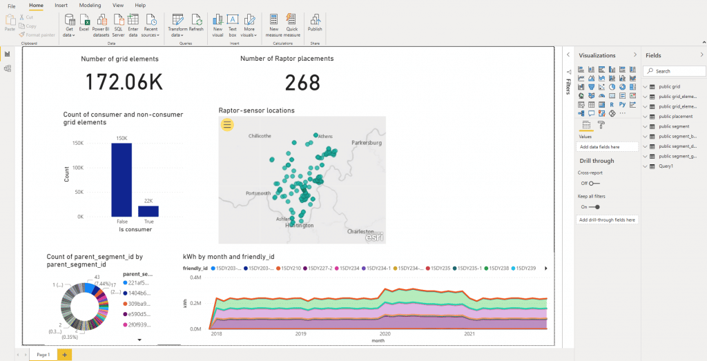
Here’s a common dashboard you might create to gain an overview of a variety of sensor devices in your energy system:

Pretty cool, right? With Power BI, you can connect to your Awesense database via the URL:
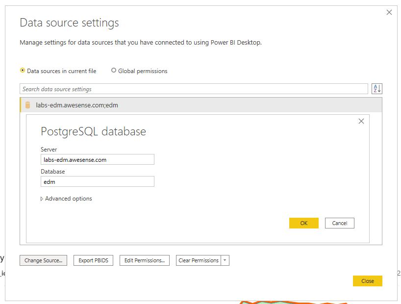
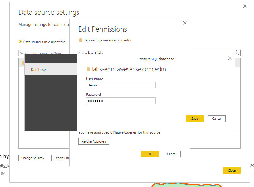
From here, it’s easy, just sign in using your credentials (but keep those secure), and away you go!
Now, you can interact with various charts and start playing around with the different functions that Power BI offers. This chart here displays consumption data in kWh from metering devices.
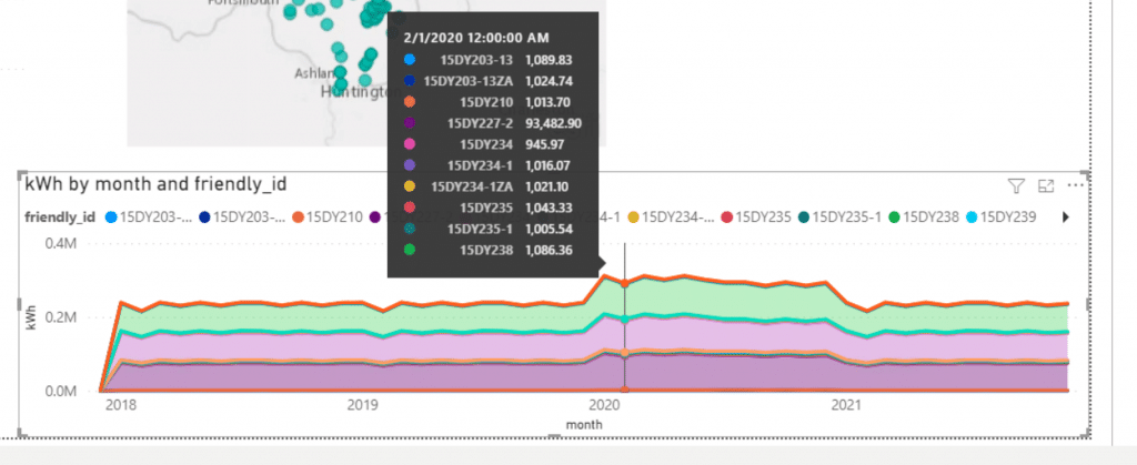
Is this chart a bit bland for your taste? Not to worry, these charts can be chopped and changed around; think of them as sophisticated Lego blocks!
Not just that, but you can use Power BI to display data from different time ranges and different sources too. Look at the tables on the right-hand side of the page where the chart pulls information. These tables are accessible directly from the database, with all your data already populated! How cool is that?
Starting Fresh
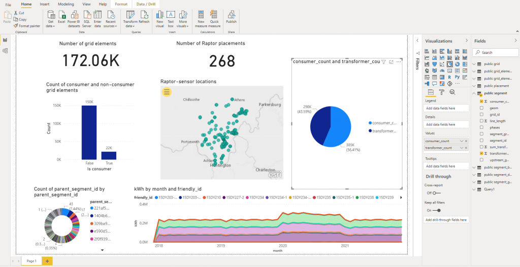
Don’t want to live in the past too much? No problem; if you want to build a new chart, you can easily do that too. For example, we created a chart that shows the breakdown between the number of consumers in your service territory and the number of transformers. Just click on a pie chart and select the two variables you want to analyze- it’s as easy as a pie (or a pie chart in this case)!
The Power of BI Tools
Chart building in Power BI and other BI tools can range from simple to advanced. The beauty of using BI tools is that analysts can create complex charts and dashboards for non-data-savvy users and share those with them. This approach allows you to share crucial information with a wider audience, giving a more holistic perspective on any issue your organization faces.
Decision-makers use this to have a data-driven approach, resulting in a much more streamlined and informed process. If there are questions you need answering, it’s likely you can get them answered through data, and it’s likely that a BI tool can help make that difference. Data is a big part of our future; the better we use it, the more we can shape a better tomorrow for our loved ones.
Not sure where to start with all that data? If you have an issue with your system or organization, chat with us, and we can help you strategize on finding the best way to answer it.
Rewarding Your Patience
We love how patient you, our technical readers, have been as we have taken the past few weeks to ramp up this series. Each piece has slowly combined aspects of the previous one to help build a solid foundation of technical knowledge for non-technical individuals. In episode five, we’ll make a bit of a bigger step when discussing data science notebooks like Jupyter or Apache Zeppelin.
Don’t get nervous non-technical folk! We are confident that you are well-equipped to handle this series; that’s why we worked so hard to get you here. We are so excited to continue educating you on the capabilities of the Awesense Energy Transition Platform. We’re confident that anyone can learn what we are trying to teach here.
Let’s Network!
We love connecting and would love for you to share our content! Follow along with this series, and let us know what ideas you would like to see us write about. Let us know whether it’s more content about the topics we’ve already written on or even a specific use case or tool you would like to know more about.
If you or your team are interested in building a custom application or use case using the Awesense Platform, or you have an analytical tool we should demonstrate with our platform, feel free to reach out to us at tools@awesense.com.
Part 5 – The Digital Energy Platform: Learn to Build Better. Ep. 5. Notebooks
